
I call this the “show me” age and the biggest winners are able to express ideas visually.
The good news is you can stand out in your personal and professional communications—and maybe even make the sale—with fabulous “data visualization” tools that are relatively easy to master. We can thank an entire generation of digital natives—yes, I’m talking about millennials—for helping develop these tools and making “data viz” a reality for the rest of us.
Speaking of millennials, they often are referred to as the “me” generation, and it’s a characterization I strongly disagree with. You will, too, after reading this month’s cover story, a compendium of interviews with industry members who are millennials and Gen Xers. This is a thoughtful, intelligent and generous group—of complete individuals—who aren’t following from behind, but are showing the rest of us the way.
Here’s one more story plug—at BedTimes we understand the importance of showing rather than telling. Check out the Market Report. It’s a photo album and extended captions of new products spotted at the Summer Las Vegas Market July 31-Aug. 4. We like that format because, not only does a picture tell 1,000 words, but it attracts readers like catnip. On the page and on screen, stories with lots of pictures draw the eye and pull readers in—and they can find a second life on Facebook, Instagram, Pinterest and Twitter.
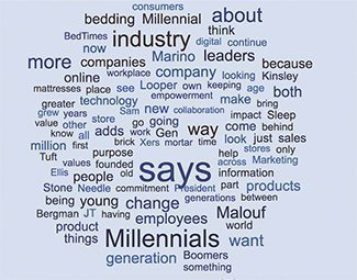
A word cloud created from the text of this month’s cover story on millennial mattress-industry members
But back to the fascinating, burgeoning data visualization field. I’ve been fascinated by data viz since creating my first free Wordle years ago. A Wordle is a “word cloud.” The original tool, at Wordle.net, requires Java, a plug-in that doesn’t play well with the Chrome browser, so I’ve moved on to other word cloud generators. Did you know that many of these web-based services are free? I used WordItOut.com to create the illustration on this page. I hope it gives you a visual idea of what this month’s cover story is about. I created it by pasting the entire story text into WordItOut.
If you’d like to get serious about developing your data viz tool chops, try the easy-to-use Infogr.am dashboard and illustrate your website, presentations and social media posts with great infographics and charts. The basic version is free and the click-and-drag interface is easy to master—again, no coding required.
The Infogr.am blog provides plenty of advice on using the tool and offers insight into the booming and evolving field of data visualization.
Visme is another data viz tool for noncoders and may be just the ticket for crafting your next highly visual sales pitch/PowerPoint presentation. Create a free account at Visme.co—it bills itself as “a simple tool to translate your ideas into engaging content in the form of infographics, product presentations, web content, reports” and more. Plus, the website is nifty to scroll through.
So, go ahead, say it in pictures.
