BY JULIE PALM
From purples and blues to blacks and reds, color trends for 2018 are marked by high drama, touches of mystery and comfort amid chaos
Silvery grays. Smoky taupes. Deep blacks brought to life with bright lime green, teal or magenta. Pristine whites paired with soft shades of violet or fern.
It’s a colorful time in the bedding world, and with manufacturers having embraced all the hues of the rainbow, BedTimes expects that the coming year will be no different. The big question is what colors will pop next?
Every year, color experts at Pantone release their Color of the Year with great fanfare. Other companies aiming to set trends in the home furnishings industry make forecasts, as well. And for 2018, the color forecasters generally are going bold, predicting that consumers will embrace vibrant, multidimensional hues that will inspire and invigorate.
To help you plan your next product launches, we’ve gathered together more than a half-dozen 2018 Colors of the Year and given you tips about color pairings. For links to more au courant palettes and other resources for color inspiration and guidance, see story on page 50.
Nothing to be shy about
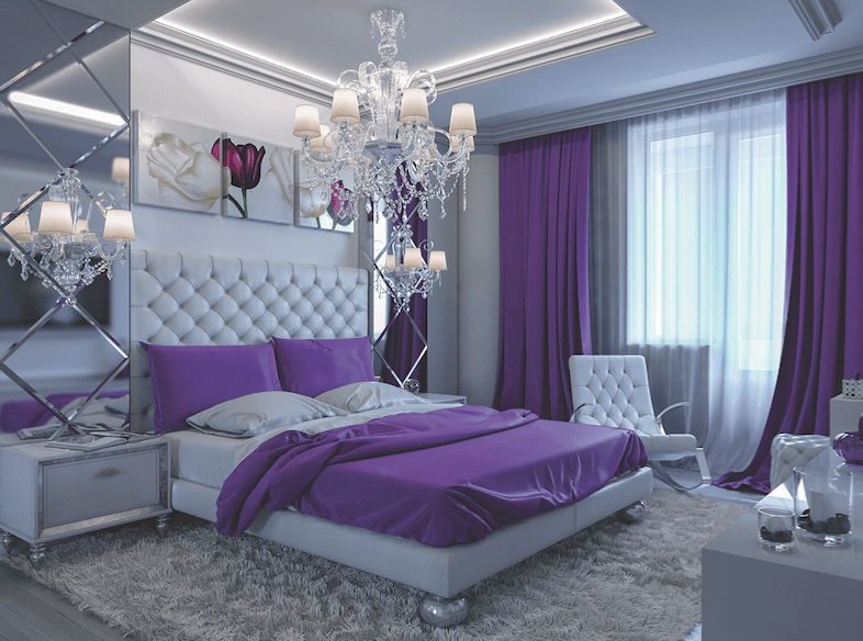
Pantone, a provider of color language standards and other color services, went ultra bold—naming a vibrant purple shade it calls Ultra Violet its Pantone Color of the Year for 2018. The Carlstadt, New Jersey-based company describes the hue as “dramatically provocative and thoughtful,” adding that it “communicates originality, ingenuity and visionary thinking that points us toward the future.”
“We are living in a time that requires inventiveness and imagination. It is this kind of creative inspiration that is indigenous to Pantone 18-3838 Ultra Violet, a blue-based purple that takes our awareness and potential to a higher level,” says Leatrice Eiseman, executive director of the Pantone Color Institute. “From exploring new technologies and the greater galaxy, to artistic expression and spiritual reflection, intuitive Ultra Violet lights the way to what is yet to come.”
Eiseman points out that purple shades have long symbolized creativity, unconventionality and artistic flair but also have a “mystical or spiritual quality” that makes them perfect for meditation rooms and other spaces designed to inspire connection and meaning.
Ultra Violet pairs well with metallics, as well as greens and grays. When used in home interiors, Pantone says, “Ultra Violet can transform a room into one of extraordinary self-expression, or conversely, its polish can tone down a room with subdued, modern pairings.”
To choose Ultra Violet as its favored shade for the year, Pantone’s color experts looked to the entertainment industry, fashion runways, artists, popular travel destinations, even athletes, social media and new technologies for direction. Pantone is perhaps the best-known annual color predictor, but it isn’t the only entity traveling the world for cues about what colors will resonate, inspire and delight in the year ahead. Of note to the bedding industry, which can draw cues from other furnishings trends, big players in the paint industry also come out with their own annual hot hues for the home.
More daring hues
And, for the most part, they’re also feeling quite bold—and a little mysterious, too.
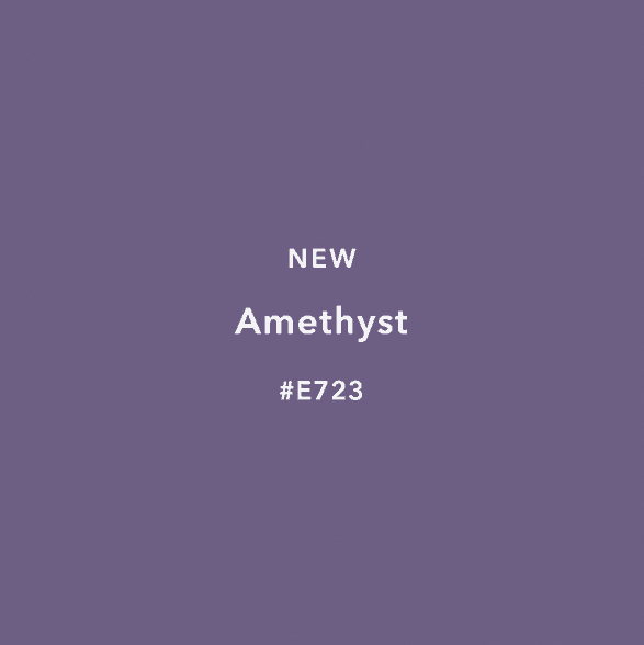
CIN, a maker of paints, varnishes and coatings based in Maia, Portugal, shares Pantone’s passion for purples in 2018 and selected Amethyst as its Color of the Year. Borrowing inspiration from the natural quartz stone, CIN describes its favored color as an “unexpected and almost magical hue” that attracts attention while radiating harmony and balance. “This darker tone (Amethyst E723) fits in with the current trends in decoration, providing nuances that are different yet bold, but at the same time, classic and refined,” the company says. Amethyst is part of CIN’s Blue Revelations nature-inspired color palette that also includes the smoky gray Blue Mountains and the azure Into the Blue.
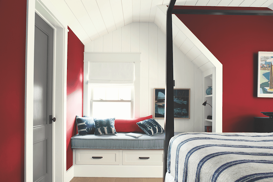
Heading in a different but still daring direction, Benjamin Moore picked Caliente, a dramatic red, as its go-to shade for 2018.
“Caliente AF-290 is total confidence. It is pleasing, passionate and makes people feel special, like ‘red carpet treatment’,” says Ellen O’Neill, director of strategic design intelligence for the Montvale, New Jersey-based paint company. “Whether used as one note or on four walls, the spirited personality of red turns heads, signaling surprise and adventure. The eye can’t help but follow its bold strokes.”
In the home interior, think of red’s versatility, O’Neill says. It’s a “bold, abstract stroke” in a midcentury modern home; a “farmhouse made crisp and current with red detailing” and “a beach house that brings in red for an unexpected neutral touch.”
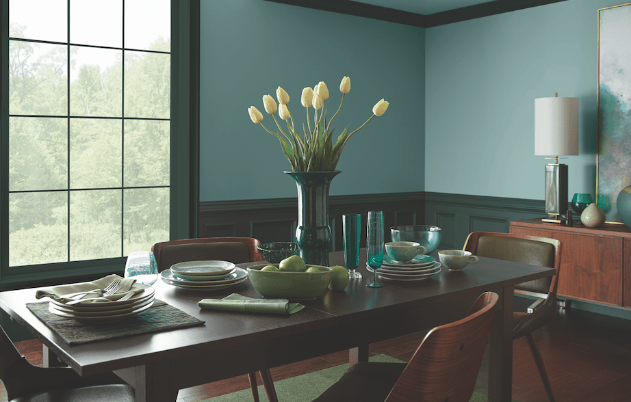
Like Pantone’s Ultra Violet, Sherwin-Williams’ 2018 Color of the Year, Oceanside, is a complex, multidimensional hue the paint company describes as “a collision of rich blue with jewel-toned green, a color that is both accessible and elusive.”
“Green-blues in deep values, such as Oceanside (SW 6459), respond to changes in light, which is a quality that creates intense dimension,” says Sue Wadden, director of color marketing for the Cleveland-based company. “It is a tremendously versatile color and harmonizes with other diverse color groups.” Oceanside holds its own against eye-popping bright pinks and yellows but also complements a range of blue shades for a meditative palette and works amiably with corals and copper metallics.
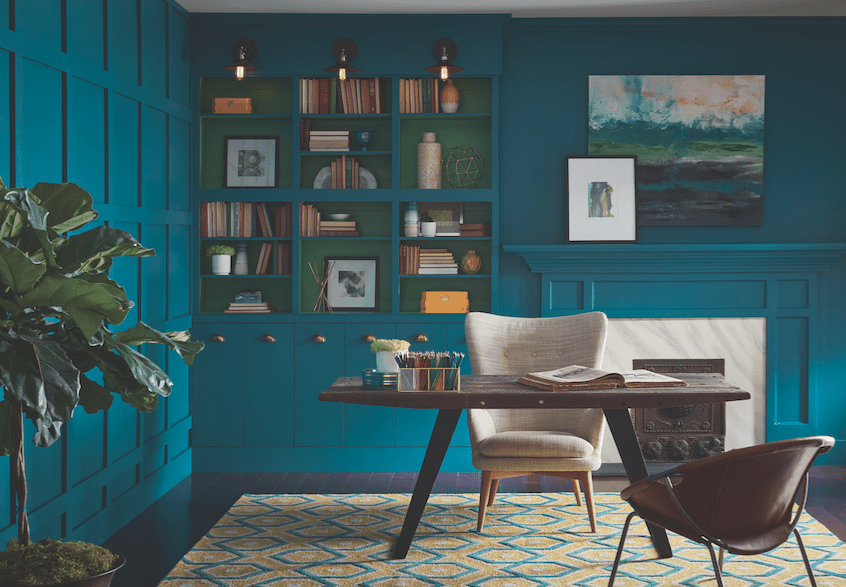
Oceanside is a multi-dimensional blue-green that responds to light. Credit: Sherwin-Williams
Back in black
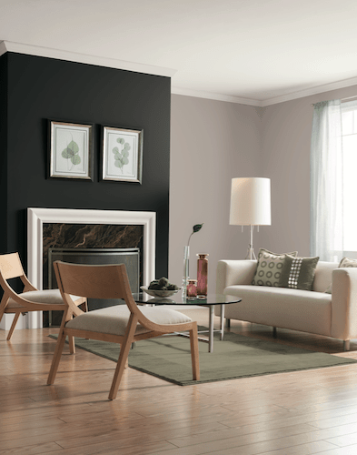
Going even bolder and darker, paint brand Glidden picked Deep Onyx, a “no-fuss shade of black,” as its hot color for 2018.
“Using a black paint color like Deep Onyx (00NN 07/000) on your walls or in your decor may feel intimidating at first, but it’s actually one of the easiest colors to use to create the low-key, easygoing style that’s trending for 2018. … Just like a little black dress, Deep Onyx is a classic, timeless staple,” says Misty Yeomans, PPG color marketing manager for Glidden paints. Glidden is part of PPG, a Pittsburgh-based global paint and coatings maker.
In interiors, Yeomans says, Deep Onyx can be paired with yellows and even browns for a natural look; with a bright white for a fresh, crisp feel; with classic primary reds and blues; and with pink tones for a natural “pick me up.”
Olympic, another PPG paint company, also went with black for 2018, in its case Black Magic. “In the current day, consumers often feel uneasy, restless or like their privacy is being invaded, so they crave deep, comforting colors that offer a welcome escape from the chaos of daily life. Olympic paint’s Black Magic (OL116) perfectly satisfies consumers’ desire for privacy,” says Dee Schlotter, PPG senior color marketing manager for Olympic paint. In home interiors, Schlotter says, Black Magic teams well with popular grays.
Soothing shades
But not every color forecaster went bright and bold for 2018.
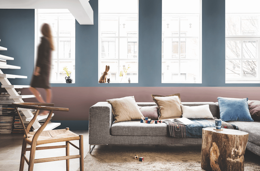
Given the seeming unpredictability of everything from the climate to politics to the economy, AzkoNobel says people are seeking “a welcome home”—a sanctuary “where we can turn down the noise, where we can nurture our values and recharge.” With that in mind, the Amsterdam-based supplier of paints and coatings, chose Heart Wood, an earthy, “gentle gray-pink tone,” as its shade of the year. Heart Wood can be layered with deep terra cottas, accented with bold shades of ink blue and purple, or made playful with the introduction of golds and yellow-toned greens.
Also favoring a softer, soothing hue was Behr, which picked the aptly named In the Moment as its 2018 Color of the Year. Combining blue, gray and green, it’s “a soothing, restorative” hue that “evokes a sense of sanctuary and relaxation amid our busy, always-on lives,” according to the paint company, which has headquarters in Santa Ana, California. In home interiors, the company says, In the Moment fits with a desire to edit belongings down to only the most useful and treasured as people simplify their living spaces for ease and contentment in a chaotic world.
The art and science (but mostly the art) of picking the right hue
Consumers react viscerally to colors, forming instant impressions both positive and negative. In fact, in the short 90-second window people use to assess a product, as much as 90% of that decision can be based on color, according to Kissmetrics, a San Francisco-based customer research and marketing firm specializing in customer engagement and segmentation.
More stats to chew on: 93% of consumers say the visual appearance of a product is the most important factor when it comes to purchases, 85% of consumers are heavily influenced by the color of a product when making buying decisions and 80% of consumers say color increases their recognition of brands, Kissmetrics reports.
So, what messages do specific colors convey to consumers? Here are some guidelines from Kissmetrics and Insights in Marketing, a marketing research firm headquartered in Northbrook, Illinois.
- Red: Denotes energy and urgency; it’s often used to signal sales or limited-time-only offers
- Orange: Appeals to impulse shoppers; creates an urgency for people to buy; linked to athleticism and energy
- Yellow: Associated with happiness, enthusiasm and joy; frequently used to grab attention or draw customers into a store
- Green: Creates a sense of relaxation; associated with nature, good health and environmental stewardship
- Blue: Instills a sense of security and trust; can induce calm; linked to nature
- Pink: Seen as romantic and feminine; often used for products aimed at women and girls
- Purple: Can be soothing and calming; frequently used in beauty products
- Black: Associated with power and wealth; denotes luxury products
- White: Seen as clean and pristine; conveys innocence and purity.
Used in combination, colors can take on different meanings. For instance, when teamed up, blue, white and green are associated with trust, while the combination of black, blue and green denotes security. It makes sense then that those color combinations often are used on law enforcement vehicles. In contrast, when yellow, brown and orange combine, the message can be “cheap” and a trio of yellow, white and red conveys speed—think of virtually every fast-food joint you’ve ever visited.
Given their emotional pull, colors can attract certain types of buyers. For instance, red, orange, yellow and even black can appeal to impulse shoppers, while navy blue and teal attract the attention of budget-conscious consumers, according to Kissmetrics. Pinks and paler blues can prompt traditional shoppers, who want to make well-reasoned decisions, to open their wallets.
All that said, we must issue a big caveat here: Perceptions of color are highly subjective, varying not only from person to person but from region to region, country to country, culture to culture. (We should note that much of the research into this subject is based on consumers in North America so always keep that in mind.) Color perceptions also can be influenced by factors like light levels and one color’s proximity to other colors. In short: When we talk about the psychology of colors, we speak in broad generalities.
“Color is personal. It evokes different emotions in different people,” Judith van Vliet, vice president of communications and public relations at the Alexandria, Virginia-based Color Marketing Group tells the American Marketing Association in “Three Things International Marketers Should Know About Color.” Van Vliet says companies have the entire spectrum open to them when choosing colors—the key is finding colors best suited to each marketing campaign or new product.
That means when you’re making color decisions about products that will be sold in other parts of the world, you should consult with manufacturing and supplier partners, marketing professionals or even color specialists in those regions to confirm you aren’t sending mixed or negative messages with your choice of hue.
And although certain colors can evoke specific emotions and even prompt action, it’s more important that the colors you choose for products, packaging, point-of-purchase items, marketing campaigns and even your overall brand be appropriate to the product or your message. In other words, the colors you choose should “support the personality you want to portray instead of trying to align with stereotypical color associations,” says Gregory Ciotti, a Philadelphia-based content marketing strategist who writes on color and other branding topics for Entrepreneur and other publications.
For instance, Ciotti writes, “if Harley owners buy the product in order to feel rugged, you could assume that the pink plus glitter edition wouldn’t sell all that well.” Similarly, Ciotti says, “while brown may be useful for a rugged appeal (think Saddleback Leather), when positioned in another context brown can be used to create a warm, inviting feeling (Thanksgiving) or to stir your appetite (every chocolate commercial you’ve ever seen).”
Just for fun
 Trying to decide on a signature color as part of a major rebranding? Wondering what the best palette would be for your next bedding collection?
It won’t take the place of a major color study, but Grasshopper, a Boston-based provider of business services for small enterprises, offers a fun tool. Its seven-question quiz promises to help you pick the right color for your brand relaunch or product introduction. Check it out here.
Still part of the coloring box
Colors can define an era—say the avocado greens and harvest golds of the 1970s—and then fall out of favor. But many recent popular hues continue to delight both designers and consumers. Chances are you’re still seeing, and perhaps using, some of Pantone’s recent Color of the Year picks in bedding products and packaging.
- 2017: Greenery (Pantone 15-0343)
- 2016: Serenity and Rose Quartz (Pantone 15-3919 and 13-1520)
- 2015: Marsala (Pantone 18-1438)
- 2014: Radiant Orchid (Pantone 18-3224)
- 2013: Emerald (Pantone 17-5641)
- 2012: Tangerine Tango (Pantone 17-1463)
Resources
One of the best resources when it comes to color guidance for bedding manufacturers is the in-house designers at mattress fabric and sewn-cover suppliers. Like the professional color forecasters, they study trends in fashion, home furnishings and other arenas, translating those into palettes for tomorrow’s sleep products.
For more color inspiration and guidance, take advantage of these other aids offered by color forecasters and experts, particularly as you plan for upcoming launches.
- AzkoNobel’s Colour Futures: Four palettes for the interior, all centered on AzkoNobel’s 2018 Color of the Year, Heart Wood, plus three consumer personas tied to the palettes.
- Benjamin Moore’s Color Trends 2018: Images of home interiors featuring the paint company’s Color of the Year, Caliente, plus a 23-color palette of complementary hues for home décor.
- CIN’s Color Revelation: A look at CIN’s Color of the Year, Amethyst, plus four nature-inspired tonal palettes.
- HGTV’s Psychology of Color primer: An easy-to-use guide to the perceptions and association’s people have about various colors, along with tips for how particular hues can enliven the home interior.
- PantoneView Home + Interiors 2018: Eight palettes for home interiors for 2018. Includes 75 forecasted Pantone cotton standards for soft home applications. $495.
- Sherwin-Williams’ Color Mix Forecast 2018: Three color palettes—Sincerity, Unity and Connectivity—for these times.