Picks for the hot hue of 2022 are rooted in consumers’ desire to spend more time outdoors and their need to renew their spirits
There’s a famous scene in the film “The Devil Wears Prada,”in which Meryl Streep’s character Miranda Priestly, a powerful fashion magazine editor, dresses down new hire Andy Sachs (played by Anne Hathaway) for thinking fashion is frivolous.
It starts with Andy, wearing a blue sweater, scoffing at choosing between two belts for a photo shoot when she thinks they’re identical. Indulge us for sharing the scene in full. If you’ve seen it, you can just hear Streep as Miranda, her voice confident of her taste-setting expertise and dripping with disdain for her new hire’s naivete.
Miranda Priestly: Something funny?
Andy Sachs: No, no, no, nothing. Y’know, it’s just that both those belts look exactly the same to me. Y’know, I’m still learning about all this stuff and uh …
Miranda Priestly: This “stuff?” Oh, OK. I see. You think this has nothing to do with you.
You go to your closet and you select, oh, I don’t know, that lumpy blue sweater, for instance, because you’re trying to tell the world that you take yourself too seriously to care about what you put on your back. But what you don’t know is that that sweater is not just blue, it’s not turquoise, it’s not lapis. It’s actually cerulean.
You’re also blithely unaware of the fact that in 2002, Oscar de la Renta did a collection of cerulean gowns. And then I think it was Yves Saint Laurent, wasn’t it, who showed cerulean military jackets? (I think you need a jacket here.) And then cerulean quickly showed up in the collections of eight different designers. Then it filtered down through the department stores and then trickled on down into some tragic Casual Corner where you, no doubt, fished it out of some clearance bin. However, that blue represents millions of dollars and countless jobs and it’s sort of comical how you think that you’ve made a choice that exempts you from the fashion industry when, in fact, you’re wearing the sweater that was selected for you by the people in this room. From a pile of “stuff.”
The point, of course, is that popular colors — in apparel, in home furnishings, in consumer packaging, in automobiles — don’t appear out of nowhere. Designers, trendsetters, color analysts and others spend a lot of time thinking about the colors they’ll use for the Subarus and sweaters consumers will want to purchase in the year or two ahead. Their choices matter.
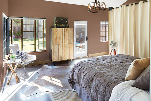
In the home furnishings realm, paint brands and the venerable Pantone Color Institute make big splashes with their Color of the Year picks. We’ve gathered their choices for 2022 as a guide to colors that are likely to start appearing in consumers’ homes, bedrooms and possibly beds themselves.
Going green
There was remarkable consensus among companies choosing Colors of the Year, with many forecasters picking organic, grounding, earthy greens, the kinds of hues found in plants, or grays with green undertones. Think foggy mornings in a lush countryside.
Olive Sprig
PPG’s Color of the Year is Olive Sprig (PPG1125-4), a soft, neutral, midtone gray-green “like a fragrant plant, reminiscent of the natural world,” according to the Pittsburgh-based company. Olive Sprig’s “organic liveliness” will “brighten any space” and is a good partner for soft rose tones, PPG says.
Guacamole
Glidden, part of the PPG family of brands, went a little brighter than Olive Sprig but stayed in the green family when selecting Guacamole (PPG1121-5). Glidden’s public relations folks were playful when announcing their pick: “We have taken our green- and guac-loving affinity to a whole new level. Our 2022 Color of the Year is not only named after our fav food but is also one of our fav greens to use on any wall or accent. This spirited yet soothing green brings an organic energy to any space, which is needed because we all know you’ve probably killed at least three plants this year.”
Glidden notes that Guacamole (the paint, not the dip) and the company’s coordinating trend palette will help “create that bedroom retreat you’ve always dreamed of.”
(Many on the BedTimes team consider freshly made guacamole a must-have at any mealtime meeting, so we endorse this pick, at least from a culinary standpoint.)
October Mist
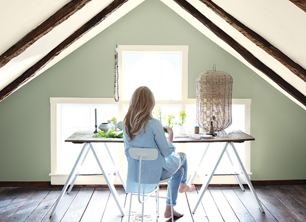
Benjamin Moore also leans on plant references in describing its Color of the Year, a “gently shaded sage” called October Mist (1495). “Evoking the silver-green stem of a flower, October Mist creates a canvas for other colors — and your imagination — to blossom,” the Montvale, New Jersey-based paint company tells consumers.
October Mist (1495) is part of a palette of 14 “harmonious yet diverse, reliable yet whimsical and meditative yet eclectic” hues Benjamin Moore chose as trendy colors for 2022. Other colors in the palette include Mysterious (AF-565), Hint of Violet (2114-60), Morning Dew (OC-140), Pale Moon (OC-108), Fernwood Green (2145-40) and Steam (AF-15).
Evergreen Fog
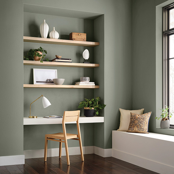
The color forecasters at Sherwin-Williams tapped Evergreen Fog (SW 9130) as the trendsetting color of 2022, calling it “a versatile and calming hue, a chameleon color of gorgeous green-meets-gray, with just a bit of blue.”
Like other green and gray-green choices from paint purveyors, it has an organic feel inspired by nature.
“Evergreen Fog is a sophisticated wash of color for spaces that crave a subtle yet stunning statement shade,” says Sue Wadden, director of color marketing at Cleveland-based Sherwin-Williams. “Evergreen Fog inspires us to begin again.”
The color lends itself to spaces, like bedrooms, that consumers use for rest and relaxation, according to the company.
Evergreen Fog pairs well with other organic neutrals, such as the company’s Shoji White (SW 7042), Accessible Beige (SW 7036) and Woven Wicker (SW 9104), as well as more “tonal luxurious hues,” including Urbane Bronze (SW 7048), Über Umber (SW 9107) and Bakelite Gold (SW 6368), Wadden says.
Minneapolis-based Valspar, part of Sherwin-Williams, didn’t choose a single standout color for 2022, but its palette of 12 trendy hues, including a mossy green called Blanched Thyme, also is drawn from nature.
Laurel Leaf
This year, the magazine Better Homes & Gardens picked its first Color of the Year, selecting Laurel Leaf, a dusty, leafy green for its branded paints sold only through Walmart.
“During the pandemic, people spent more time outside enjoying their backyards, parks and other outdoor spaces,” says Max Wilker, style director for the Better Homes & Gardens brand. “And now those shades of green are coming along back inside the home.” Laurel Leaf goes well with creamy whites, warm beiges and wood tones, and creates a relaxing bedroom environment, Wilker says in a January Better Homes & Gardens article.
Breezeway
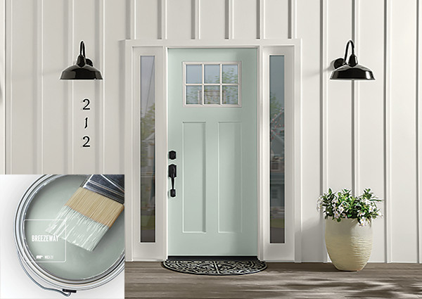
Behr’s Color of the Year is a lighter, more luminescent green, think sea glass rather than seagrass.
“A new year brings the opportunity to embrace a sense of renewal and pursue untapped passions,” says Erika Woelfel, vice president of color and creative services at Behr in Santa Ana, California. “Whether it’s lacing up our hiking boots or breaking out the gardening tools, Breezeway inspires us to fully embrace the hobbies or adventures, both near and far, that excite us. We look forward to a color that welcomes a hopeful sense of renewal, restoration and healing.”
Breezeway (MQ3-21), a “silvery green shade with cool undertones,” works well with white, gray and wood tones, the company says.
Even earthier
While many color forecasters drew inspiration from the plant world, paint company Dunn-Edwards went deeper for its 2022 pick. Art and Craft (DET682) is a warm, “moody,” “nature-based” brown that “evokes feelings of stability and calm while allowing for a large range of play with creativity and change,” according to the company.
“Art and Craft is a timeless shade that embodies both the past, as well as the optimism and excitement of the future,” says Sara McLean, color expert and stylist for Los Angeles-based Dunn-Edwards.
Art and Craft is part of Dunn-Edwards’ broader trends forecast, which it calls “naturrensing.” “This trend highlights the need to cut back on clutter, refocus on what’s essential and get in touch with our earth-loving roots,” the company says.
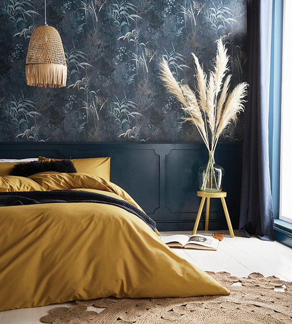
Feeling blue
The earth provided inspiration to color forecasters picking 2022 hues, but so did the sky, with a few choosing buoyant blue hues.
Bright Skies
Dulux, a paint manufacturer based in Slough, England, says its Color of the Year is a “fresh tone that opens up and breathes new life into any space.”
Airy and optimistic, Bright Skies is a “blue that’s good for the soul,” says the company, part of paint and coatings global giant AkzoNobel. “It promises to open up and revitalize your home.”
When choosing the color, Dulux’s color forecasters considered a number of broader trends, including the growing role of the home and nature in people’s lives and the importance of embracing “new voices and ideas for a brighter future,” the company says.
Breathe
Graham & Brown, a maker of paint, wallpaper and other home decor items based in Lancashire, England, selected Breathe, which it describes as “a soothing midblue, perfect for creating calm and peaceful spaces, which is exactly what we all need for the year ahead.” The color works well with crisp whites and cool grays, as well as “deeper blues to create a moody hideaway.”
And speaking of moody, Graham & Brown also chooses a Wallpaper of the Year. For 2022, it’s Restore Midnight, featuring “wild trails of exotic botanicals taking over a soothing, smoky blue backdrop.” Designed with “healing, rejuvenation and reconnection with nature in mind,” it’s a good choice for bedrooms.
Aleutian
HGTV’s Color of the Year, chosen for its paint collection with Sherwin-Williams, is a “dreamy washed indigo” and part of a Softened Refuge palette from the home-centered TV and media company.
“Tranquil and restorative, Softened Refuge is sweeping over us like a comforting blanket. Comprised of 10 muted tones — including Color of the Year Aleutian — the palette boasts clean minimalism in sanctuary-like spaces.”
What the Best-Dressed Beds Will Wear
Fabric and tape makers find inspiration in nature, warm neutrals and pops of color for their latest collections
To choose their palettes, designers involved in the fashion side of bedding look to broad trends in apparel and home furnishings, as well as developments in everything from video games to art.
Brandon Wells, for one, wants bedding producers to embrace color as they create their new mattress collections. “The industry has been talking about adding color for several years, but always seems to fall back into a ‘safe zone’ of gray, black, white, etc. We believe the time is right for bedding manufacturers and retailers to embrace the newer colors,” says Wells, executive vice president and general manager for the mattress division of Standard Fiber, a maker of mattress fabrics and covers with offices in Burlingame, California.
Those “safe” hues remain in many company’s palettes, but both nature and the digital world are inspiring lots of color choices, too.
BedTimes talked to several industry designers about the colors they’re using in mattress fabrics, tapes, covers and other components to catch the consumer’s eye and asked what excites them about 2022 palettes.

1. What are key colors you are seeing for mattress fabrics and tapes in 2022?
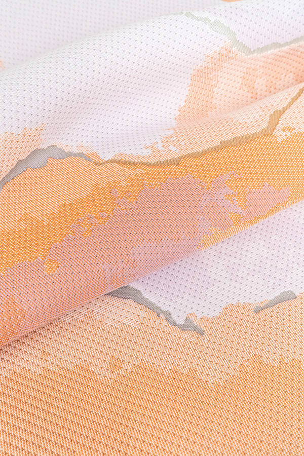
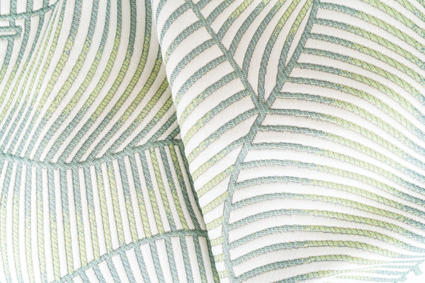
“This year, we are seeing a balance of soft, comforting palettes with bright and vibrant hues that invigorate our senses. The key colors to look out for are neutral and balanced greens, deep and familiar blues, as well as some pops of purples and rust tones. Each color this season stands strong on its own, while also being integrable with previous and potential color trends.”
— Cindy Kreefer, product designer for Standard Fiber
“The key colors selected by the Lava design team are a well-balanced combination of, on one hand, comforting shades that promote mental well-being and, on the other hand, “character” colors that show how exciting the future can be. This means we see plain whites converted into our new neutrals (off-whites, creamy buttermilks) followed by a strong “going gray” palette that can be soft and light colors, as well as dark tints like gravel grays and charcoal blacks. Also, a blue hue — beautiful water tones are included in our collection.”
— Ann Weaver, vice president of sales and marketing
for Lava USA in York, South Carolina

“Earth tones will bring calm and comfort to the bedroom using neutral hues. Digital pastels are inspired by digital filters and are diffused in ombre patterns. Nourishing greens are driven by nature and reflect the outdoors. Cool blues evoke calm and cleanliness. Sun-backed (blue) shades convey reassuring energy, and aqua and violet bring newness. (We also are seeing) touches of luxe metallics, and all-natural colors with softer shades of taupe and stone via ethically sourced natural fibers.”
— Charlene Vaz, design and marketing director
for BekaertDeslee North America, a textile manufacturer
with U.S. offices in Winston-Salem, North Carolina,
and global headquarters in Waregem, Belgium
“Various blues (midrange navy and very dark navy, almost black), as well as black, charcoal and midgray, plus some neutrals: browns, golds and naturals.”
— Patsy Allen, design consultant and account manager
for Bo-Buck Mills, a maker of mattress tapes and
other narrow fabrics based in Chesterfield, South Carolina
“We see the market slowly moving to warmer colors, but the navies and grays will remain strong.”
— Camilla Franklin, vice president of design and marketing or Creative,
a provider of mattress fabrics, zippered covers and other
bedding components based in Gastonia, North Carolina

“The colors that remain strong for 2022 are neutrals — varying shades of warm grays that read as opulent and fresh.”
— Christina Pennant, creative director for Culp Inc.,
a fabric and zippered cover manufacturer
with headquarters in High Point, North Carolina
“The 2022 color palette for mattress fabrics looks like it will be dominated by black/charcoal and black/gray design combinations, which contrast nicely. Athletic gray continues to be strong.”
— Skip Kann, director of special projects
or Fine Cotton Factory, a supplier of fabrics
and finishings based in Etobicoke, Ontario
“We are sensing a very elemental color palette, based on earth, air, fire and water. In this era of uncertainty, people have an even greater need to feel grounded. Earth encompasses stone colors, ranging from medium grays (with and without metallic luster) to deep charcoal. Grays are leaning more toward taupe, and nurturing browns, such as chestnut and mushroom are returning. Pops of copper and silver mix well with all these and hints of mossy green. Air is indicative of the pervasive calming essence of soft blue tones. All of us yearn for clear skies ahead, and these shades remind us of calm, tranquility and new horizons. … Palest dove gray feels as gentle and quiet as a foggy morning. … Fire is seen in the brilliance of bright colors from all shades of visible light. As digital components become intrinsic is our everyday lives, new color standards also are ushered in. These colors signal new ideas with the capacity to set creativity ablaze. Water … we can’t survive without it. The entire range of blue tones, from lagoon to marine to the deepest navy, is here to stay. Contrasting blue with black adds depth, complexity and substance.”
— Laura Allred, senior product manager, and Priscilla Peralta,
product manager, for AEC Narrow Fabrics, a producer of mattress
tapes, handles and elastics based in Asheboro, North Carolina
2. What current color trend in the bedding industry do you think is most exciting?

“Bright pops of accents colors.”
— Allen, Bo-Buck Mills
“I love the use of green this season. We have been stuck in a very gray world for several years and bringing in some sage and mossy tones adds a bit of warmth back to the neutral shades we’ve been used to. They pair well with other neutrals for soft and soothing palettes, but also add depth to a bright and bold palette.”
— Kreefer, Standard Fiber
“The big excitement is seeing colors in sustainable yarns. What was previously only ecru for the mattress industry has gained a more fashionable approach.”
— Vaz, BekaertDeslee
“Looking at the trends in the interiors area, dusty blues combined with soft golds and soft warm bronzy beige colors are becoming more mainstream and will move into the bedding area. The athleticwear market is continuing to drive pops of vibrant, saturated colors of various hues as accents. These bold colors can be used in borders, tape-edge, zippers and point-of-purchase items to make a statement and attract consumers.”
— Franklin, Creative