

Color experts select hues ranging from vibrant magenta to clean white to express hope and renewal.
After the challenges of the past several years, color forecasters think people are ready for a bit of optimism.
In 2022, color experts and trend forecasters predicted comforting shades of blue, green and brown would lead the way in home and fashion. This year, several color picks are warmer and brighter. Nature still figures strongly in these choices, but it’s a shift from the serenity of last year.
We’ve gathered a few of the colors of the year selected by color authorities and designers to show what they think will be fashion-forward in apparel and the home. Perhaps it will be inspiration as you plan mattress designs and marketing campaigns.
A touch of joy
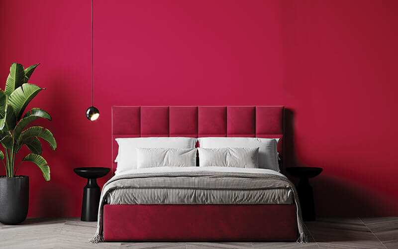
The Pantone Color Institute makes a splash every year with its Color of the Year choice. This year it’s no different. Carlstadt, New Jersey-based Pantone selected a vibrant “nuanced crimson red” — Viva Magenta 18-1750 — to capture the tone of 2023.
“We chose this color because we felt that it was an unconventional shade for an unconventional time, something that could present us with a new vision,” Leatrice Eiseman, executive director of the institute, told Time magazine. “It’s a color that really vibrates with vim and vigor, that demonstrates a new signal of strength, which is something we all need for a more optimistic future.”
Nature provided inspiration for the color, she says, noting it reflects the cochineal dyes derived from insects and used since the second century BCE. At the same time, Viva Magenta signals power and strength.
“The name of the color itself tells you this is a color to celebrate with, an exuberant color that promotes optimism and joy,” Eiseman says. “It’s what we call a boundless shade, a real standout statement. There’s no way you’re going to walk into a room if you’re wearing this color and not have attention go to you. It’s audacious. It’s witty and inclusive — it welcomes anyone and everyone with the same rebellious spirit.”
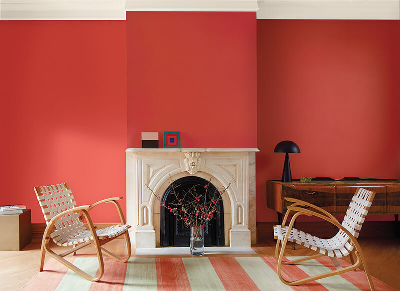
Benjamin Moore tapped into a similar feeling with its pick — Raspberry Blush 2008-30. A saturated coral tinged with pink, Raspberry Blush exudes a bright, cheery tone.
senses with an electric optimism.”
“People are ready to bring color back into the home, taking a step outside their color comfort zones,” says Andrea Magno, color marketing and development director for the Montvale, New Jersey-based paint company, in a news release. “Raspberry Blush 2008-30 and the Color Trends 2023 palette empower the use of statement colors that deliver delight and personality while transforming rooms for incredible results.”
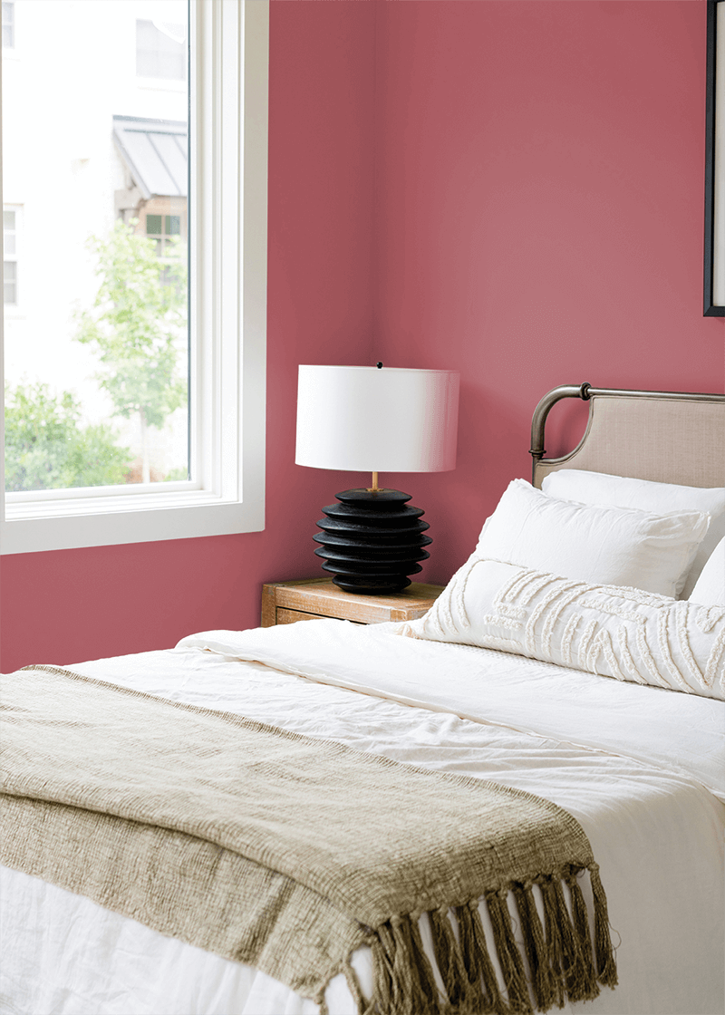
Paint company Dunn-Edwards embraced the red family, but with a more toned-down hue. Its color of the year — Terra Rosa — blends brown and burgundy to produce an earthy, rosy pink.
Reds and oranges represent strength and intensity while pinks lean into sweetness and nostalgia, according to the website of the Los Angeles-based company. Terra Rosa blends the two “for refreshing reassurance,” the company says. “Consumers are still being drawn to comfort colors with natural infusions well into 2023 as we continue to see global chaos.
“Terra Rosa highlights living a life filled with joy and finding the beauty in everyday small pleasures. The grounding quiet comfort of Terra Rosa provides a touch of prettiness with the influence of pink, yet still can create drama with its deep value.”
Comfort still reigns
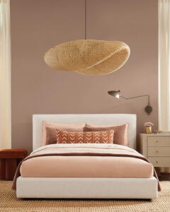
While Sherwin-Williams’ Color of the Year Redend Point SW 9081 shares some characteristics with Terra Rosa, this warm mauve leans into coziness.
“It’s as if beige could blush,” Sue Wadden, color marketing director at Sherwin-Williams, told Elle Decor. “It’s a pink-undertone neutral that is warm and earthy, and it has a certain softness and soothing quality to it that is really unique. … We felt that Redend Point really broadcasts how color can be not only grounding but nurturing, reassuring and familiar.”
The Cleveland-based paint company began meeting early in the year to decide what would drive color trends in the season to come. “We really dialed into the conversation about empathy and humanity, and how we wanted the Color of the Year to fall in line with this idea of being good to each other,” Wadden said.
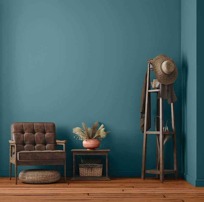
Glidden, a paint brand headquartered in Pittsburgh, opted for versatility in its choice of Vining Ivy PPG1148-6, which intertwines a jewel-toned blue-green, reminiscent of the ocean. The company calls it “bluish-greenish-something-in-betweenish.”
“Consumers are seeking to simplify, as the past two years have shed a new light on the importance of serenity and little moments,” says Ashley McCollum, Glidden color expert. “Vining Ivy embodies this vibe perfectly. It is energizing yet grounding, and it works in literally any space. Its versatility takes the guesswork out of design, leaving consumers with more time to indulge in the things that matter most to them.”
creating a sense of energy and positivity.
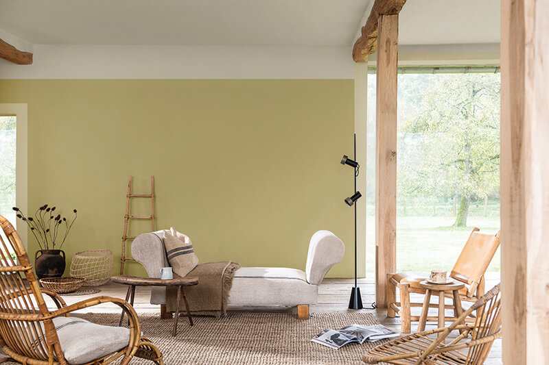
AkzoNobel Global Aesthetic Center’s Color of the Year, Wild Wonder, brings to mind the warm golden yellow of harvested crops. The paint company says the color lends a sense of energy and positivity.
“Wild Wonder speaks to us in a language we instinctively understand,” says Heleen van Gent, creative director of AkzoNobel’s Global Aesthetic Center in Amsterdam. “Nature is what inspires us and makes us feel better in our lives and in our homes. That’s why, for the first time in 20 years, our entire color palette is inspired by the rhythms of nature.”
The company’s other paint palettes include Lush Colors (forest hues), Buzz Colors (meadow brights), Raw Colors (harvest shades) and Flow Colors (seashore tones).
Fresh start
Maybe Behr Paint Co.’s shade is the most optimistic of all.
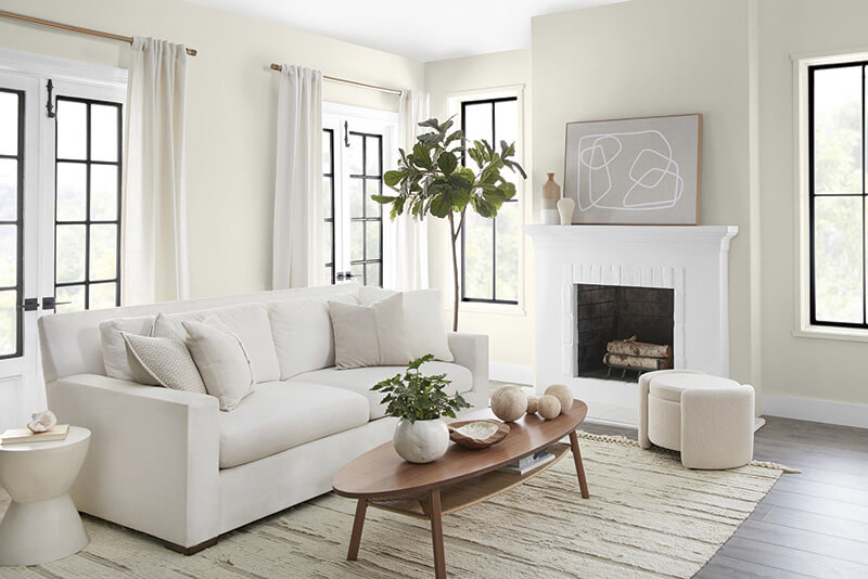
Blank Canvas harmonizes with a wide range of hues, including neutrals, earth tones and pastels, according to Erika Woelfel, vice president of color and creative services at Behr.
The Santa Ana, California-based company selected Blank Slate, a warm off-white with undertones of brown and gray. “White is the perfect color for starting fresh,” says Erika Woelfel, Behr’s vice president of color and creative services. “It’s restorative.”
Behr seeks to capture the feeling of renewal after years of uncertainty, she says.
“We understand that comfort will still be a driving force behind design decisions and style statements,” Woelfel says. “Blank Canvas effortlessly offers a clean and inviting blank slate that allows individuality and creativity to flow freely.”
Whether choosing a vibrant hue or a warm neutral, designers and marketers clearly have plenty of options that tap into consumers’ desires for energy and renewal. Color may be just one element of design but adjusting color palettes is a great place to start anew.
