

It may be fall, but fashion designers and Pantone already are thinking about spring.
New York Fashion Week in September highlighted colors that ranged from vibrant to earthy, Pantone Color Institute based in Carlstadt, New Jersey, noted in its spring color report.
“Reminiscent of the hues that surround us in nature, our Spring 2017 Fashion Color Report evokes a spectrum of emotion and feeling,” says Leatrice Eiseman, executive director of the Pantone Color Institute. “From the warmth of sunny days with Primrose Yellow to the invigorating feeling of breathing fresh mountain air with Kale and the desire to escape to pristine waters with Island Paradise, designers applied color in playful yet thoughtful and precise combinations to fully capture the promises, hope and transformation that we yearn for each spring.”
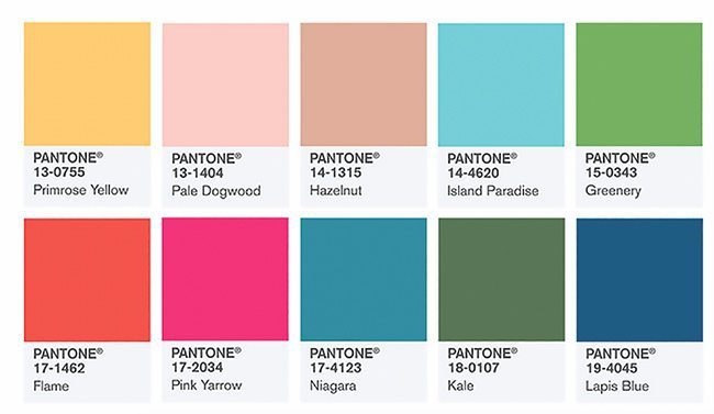
The top 10 colors forecast for spring are:
- Niagara (PANTONE 17-4123): According to the Pantone Color Institute, “Comfortable and dependable, Niagara leads the Pantone Fashion Color Report as the most prevalent color for spring 2017. Niagara is a classic denim-like blue that speaks to our desire for ease and relaxation.”
- Primrose Yellow (PANTONE 13-0755): This hue evokes warmth, joy and sunny days.
- Lapis Blue (PANTONE 19-4045): This energetic shade is considered to be strong and confident and “imbued with an inner radiance,” Pantone says.
- Flame (PANTONE 17-1462): This red-based orange is described as a “wonderfully theatrical shade” that’s “gregarious and fun loving,” as well as “flamboyant and vivacious,” Pantone says.
- Island Paradise (PANTONE 14-4620): Swinging back to the relaxing blues, this aqua hue brings to mind tropical settings and a desire to unplug.
- Pale Dogwood (PANTONE 13-1404): This subtle pink shade “engenders an aura of innocence and purity,” Pantone says.
- Greenery (PANTONE 15-0343): This yellow-green can be seen in nature’s foliage and evokes feelings of reinvigoration.
- Pink Yarrow (PANTONE 17-2034): This vivid, exuberant shade moves back into the tropical zone with its “festive … stimulating color that lifts spirits and gets the adrenaline going,” Pantone says.
- Kale (PANTONE 18-0107): This leafy green has been the healthy vegetable of choice for a few years now, and its color namesake conjures up outdoor living, a healthy lifestyle and a desire to connect with nature. This “natural green shade provides the perfect complementary background to the more vibrant tones in the palette,” Pantone says.
- Hazelnut (PANTONE 14-1315): This color is very much what it sounds like—a warm, earthy shade that acts as a neutral. “Hazelnut is a transitional color that effortlessly connects the seasons,” Pantone says.
